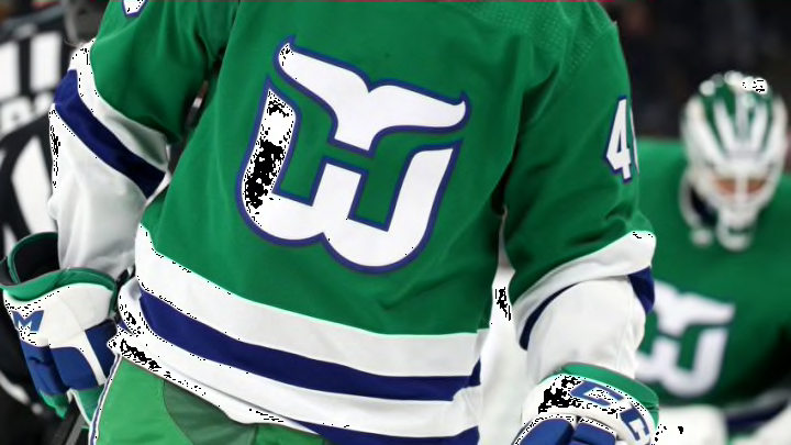
The Carolina Hurricanes got their start from the historic franchise from Connecticut in the Hartford Whalers franchise. Say what you will about hockey in Hartford but the Whalers logo, colors, and uniforms are some of the best seen by this league.
The symbol is simple yet creative with the hidden “H” in the middle of it all. The variations of the secondary logos throughout the time are fun, especially the shoulder patch with the little whale.
Recently, the Hurricanes paid tribute to the Whalers by wearing an extra jersey for special occasions which then turned into a Hartford Whalers night at PNC Arena.
Additionally, the Reverse Retro brand by Adidas for all NHL teams brought about the Whalers with a gray jersey and green numbers and letters. Of course, the whale shoulder patch returned in this jersey style.
This season the Canes went away from the former franchise and stuck with a red version of their road white jerseys.
The Whalers had a few styles in their time not to mention having a home and road jersey. The traditional green jersey is what has been chosen to continue with the Hartford Whalers night but why not adjust the versions of jerseys each year for the occasion?
I do like the green jersey but my favorite is the navy blue jersey with the gray in the logo. It would be interesting to make the white jersey or even return the Reverse Retro jersey for a night.
Personally, you can’t go wrong with any jersey with the Hartford logo and colors.
We all know the NHL and Fanatics would love the extra jersey to sell and it would sell not only in Carolina but even more all over the world.
It would bring extra excitement to the night to unveil the jersey for the specific year. My vote is navy blue! How about yours?
