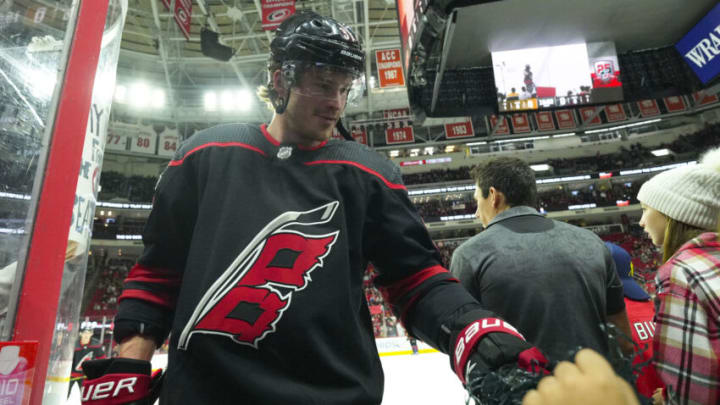
I am an unabashed fan of anything related to the Carolina Hurricanes’ uniforms. Loved the 2022 Reverse Retros. Red Helmets, please, and thank you. Stadium Series kit. Shut up and take what money I have.
Even the Hurricane’s Anniversary unis are awesome. There was nothing hockey logo-related I loved more than the negative H in the Hartford Whalers logo. Until I saw this.
Y’all want some obscure @Canes branding easter egg trivia? And not just “oh there’s an NC outline in the flag logo” stuff. I took some measurements of the @Canes stadium series font, and found that it had a very particular angle used to make it italicized. pic.twitter.com/FMEZWb472u
Y'all want some obscure @Canes branding easter egg trivia? And not just "oh there's an NC outline in the flag logo" stuff. I took some measurements of the @Canes stadium series font, and found that it had a very particular angle used to make it italicized. pic.twitter.com/FMEZWb472u
— Liberty Bell Jerseys (@LBJerseys) January 30, 2023
Somewhere, some genius decided to tilt the negative outline of North Carolina on the hurricane flags logo to exactly 9.7°Find this person, and bring them to us. Carolina Hurricanes fans owe them the finest pastries and bagels.
Should you not be following we can break it down for you
9.7° to 97 to 1997.
Still not following?
1997 was the year the Hurricanes came to Carolina from Hartford, and maybe you should just sit at home eating plain crackers.
The all black home kit has always been my second favorite behind the retro Whalers uniforms. When I first started coming to Raleigh for games in 2014, that was the alternate jersey. It was exciting, and a little bit “badass” that the team played in all black.
When they came out in the blacks, with the Killers were playing, I lost my mind every time.
While getting to see the all blacks on the regular has lost it’s luster ever so slightly, I cannot unseen this negative outline of North Carolina at exactly 9.7°
I will never look at the world around me the same way again. And if you, like me, have had your mind turned inside out, please do someone a favor and blow their mind by sharing.
