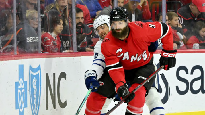
Loved by some. Hated by most. Ignored by no one. The 2022 Reverse Retro appeared on ice in Raleigh for the last time Sunday against the Pittsburg Penguins.
When the NHL released the slate of jerseys, many Carolina Hurricanes thanked the hockey gods that they chose anything other than a Hartford Whalers Reverse Retro. Apparently that has been done too much and lots of fans were ready for someone new.
What Canes fans got instead was a red schemed play on the current Canes away uniform with the diagonal letter and black shorts. Some fans were placated by the red top and black bottom combo, which a close eye would notice as a call back to last season when the team did in fact wear this combo.
Plenty were not, continuing to throw shade like it was what they were born to do.
Furthermore many boo birds were not quailed by the gear that came along with the Reverse Retro line. Particular rancor has been leveled on the two hats rolled out for the occasion. Something about the lettering just set the fans loose.
However, I could not have been more excited by the whole thing. Since the minute they dropped, I have ranked them in the top five of the whole NHL. Maybe not the top, I think only St. Louis and Vancouver edged Carolina out on historical grounds, but very close to the top.
If it were up to me, I would keep the same diagonal design and every year swap colors around. Throw in a smoke gray and you have a hit no matter how you combine the colors. Gray letters with a red sweater and black shorts one year. All black with white lettering and red outlines another year.
Sign me up and count me twice.
But while we’re on the topic of Reverse Retro, why is it the Hartford Whalers scheme is so distained? The hostility is real.
There are some completely awesome ways to incorporate the Hurricanes logos with the Hartford green and blue. What about my personal favorite, and current home jersey, the two hurricane flags in Hartford colors? Or a plain flat hurricane flag in green and blue.
We’ve not even taken the famous Hartford Whalers whale tail into the Carolina Hurricanes color palette. The hidden “H”! How can you hate that?
At the end of the day, uniform possibilities are endless. A veritable cornucopia of awesome logos abounds.
If anyone in the Carolina Hurricanes design office is reading, please feel free to consult me. Or just steal these ideas.
I don’t need credit, but if you are feeling gifty, the solid red Reverse Retro hat or a Pyotr Kochetkov jersey would be pretty cool.
When the name of the game is creativity, there will be those that love, and those that loathe. I’m going to keep digging the 2022 Reverse Retro and wearing my Whalers hat to games.
