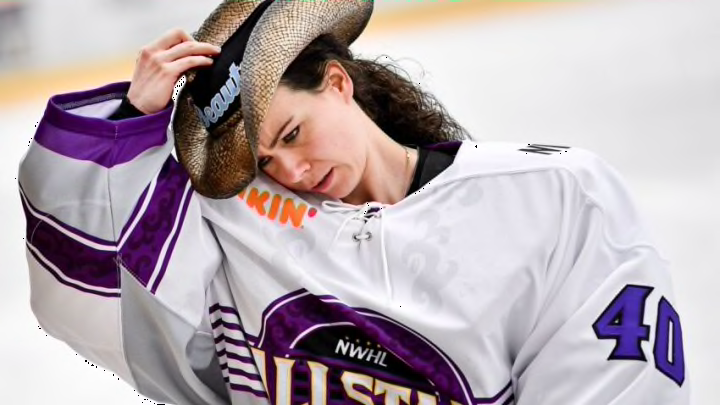
We do not comment much on the PWHL here at Cardiac Canes, but the jersey releases Tuesday are just the sort of thing that cannot be passed up. They were, underwhelming to say the least.
Our inaugural jersey designs will have us skating in style this season. 🔥 pic.twitter.com/fzIhkPrZR9
— PWHL_Toronto (@PWHL_Toronto) November 14, 2023
Let’s start with the color schemes. Boston’s is a solid hunter green and grey which looks a little bit like a Philadelphia Eagles jersey. There is no hate here and I love green but stealing from the Eagles? I do love Minnesota’s purple, black, and white. Hot take: purple is under used in sports. Same goes for Montreal’s burnt red, and dusty tan. A little Arizona Coyoteish but still love the match up and there is lots you can do with those colors. Mix in some white and your good to go.
The moment you’ve all been waiting for...🥁
— PWHL Ottawa (@PWHL_Ottawa) November 14, 2023
We are so thrilled to finally reveal our jersey designs for the inaugural season! We will be taking the ice in style this January 😎🔥 pic.twitter.com/cN5zpy2r5r
The teal from New York is great. I think instead of black and white to go with it, a dark blue would have been better but I’m not hating their set up. Red and black for Ottawa is underwhelming, even for this Carolina Hurricanes fan. It’s an over used combo. Red and orange or red and purple would have been better. I will never hate a blue jersey EXCEPT I don’t like wearing blue with blue jeans. I am weird like that so the Toronto set up is..meh. I do like the away scheme though.
The PWHL has unveiled the inaugural season jersey concepts.
— Founding4Pod (@Founding4Pod) November 14, 2023
Here are the designs for Boston, Minnesota, and Montreal. Thoughts? pic.twitter.com/el2hxiwnED
But then there is the layouts for all of the team. Not just one, but ALL four went with the diagonals. At least with the ones released on Tuesday. All PWHL teams? Did the same thing? You might find yourself asking.
Yeah…all of them. The PWHL in their first season all went with the same jersey configuration. No logos, no attachments to their cities (that we’ve seen) other than the city’s name across the front.
It seems a little bit in school when you waited until the last minute to do a project and the night before rushed to do the bare minimum. And this is coming from a guy who traditionally loves the diagonal. It’s a throwback to “old time hockey, like Eddie Shore!”
And I won’t even go into the names of the new PWHL teams. We can hope that maybe they will change with the second batch of teams. I’m not a fan of the singular team name. It seems too much like a European soccer thing, and I loath soccer.
Maybe things will get better. Perhaps the PWHL jerseys we saw on Tuesday were just the start of something awesome. The bar cannot be set much lower with what we have seen, and I think there were some real missed opportunities to roll out some crazy good logos.
For everyone’s sake, let’s hope better things are yet to come.
