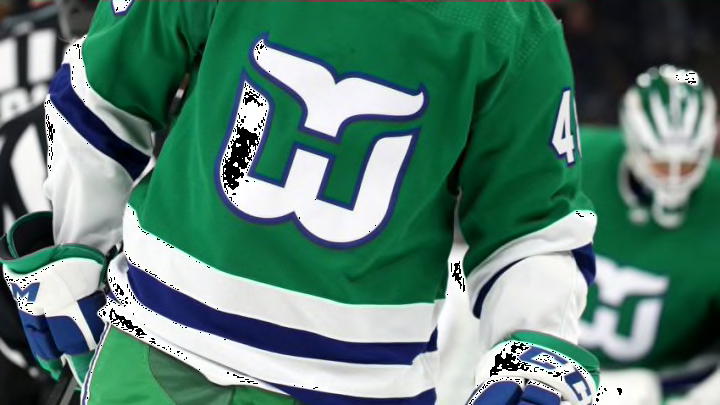
The next season is a long way away. We have not even finished this season, but I am already looking forward to the release of the Reverse Retro jersey for the Hurricanes. Glenn recently wrote about the Whalers Night jersey and I want to throw my hat in the ring with a few ideas the Carolina Hurricanes could do to really draw the Whalers concept back into good graces with a majority of the fans. This is nearly impossible and I recognize the absurdity even as I type it.

Learning as I have about the move from Hartford to Raleigh, I get that many folks wanted a clear split between the teams. Hartford was hurt, as they had lost their team. Raleigh wanted their own team, and were not looking to the past for inspiration. Still I think the Whalers jersey set up is one of the best in sports. Looking ahead, I think the Hurricanes could take some jersey elements from the Whalers and the Canes uniforms and blend them so that perhaps the fan base is either completely for, or completely against the uniforms. Trying to please everyone rarely works and usually ends up pleasing no one.
Option 1
Take the diagonals but with WHALERS. Make it on a gray background and have blue outlines on white letting. This would be one that everyone hated, or everyone loved. Fence sitting would not be allowed because the diagonals are NOT at all popular with some folks. You factor in the Whalers, and PNC might erupt as if sitting on a volcano. Still, I would be down for it, and might fork over for my first jersey. PK’s 52 would be going on the back, for sure.
Option 2
Storm flags but in green and blue. Swap the red for green and the black for blue. Use white for the white or even gray for the white. This is my all-time favorite Hurricanes jersey, and 2nd favorite behind Whalers stuff. Adding the two would be awesome. This would be cool maybe not for Whalers night but the Reverse Retro is possible. It might not fly though, since it is only retro in color scheme but I would love every minute of it.
Option 4
Go with WHALERS across the front in subtle cursive font. White lettering with a blue outline. Put it on a gray jersey with green pants. This would tick a lot of people off because it is not rooted in either the Hurricanes or Whalers tradition. Nowhere, that I am aware of, has either team used cursive on uniforms before. Again, you lose the authentic retro but they could wear it as a third jersey. It would look cool to throw the negative space “H” patch on the shoulders and away you go.
Option 5
Take the 1992-93, 1996-97 Whalers kit and swap the blue for the green and the white for the gray. Not much to it as far as design change, but it would scratch my itch as that is my favorite of the Hartford jerseys. It would be the closest thing to what the Hartford Whalers were wearing when the team moved to Raleigh, but it has a little spin on it. It is totally retro, but again that little twist
Whalers stuff is either loved or hated by Hurricanes fans and rightfully so for many, though I don’t understand it. Granted I did not have the first clue about hockey in 1997. I know I am a pariah for loving the Whalers’ influence on Carolina uniforms still, I can never un see the negative space “H.” That the Hurricanes consider their past is great. As a historian, I love it. As a budding jersey nut, I love the possibilities. You can definitely spice up the retro as well though. Switching some colors around or throwing new colors on an old log would make for an awesome reverse retro, OR a wicked awesome third or fourth jersey.
